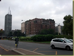
Milan is full of fine old buildings and a number of modern monstrosities. Our hotel was close to one of the central railway stations and our
first opinion of buildings in the area was not very favourable. But on the walk into town,
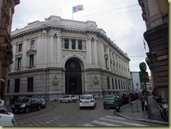
we passed buildings which externally and internally more resembled what we imagined to be representative of grand Italian architecture. Above is a bank,
here is part of the interior of the central railway station
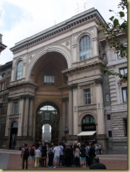
this very wide building is linked by an arch with garden on top,
and this is one of the entrances to the famous Galleria Vittorio Emanuele II
which is impressive inside (and full of top of the range shops) and has the symbol of the
Italian state in the centre of the floor.
This gate, the Porta Garibaldi built in 1825, was one of the original gate entrances to the city and miraculously has survived the planners and the war.
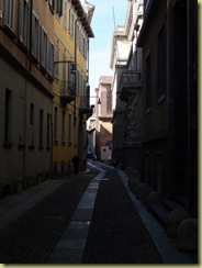
Many of the streets provide the type of vista which one expects in an Italian town,
narrow streets with tall houses
and ornate balconies.
I always get great pleasure from old buildings and how they relate to other old buildings around them.

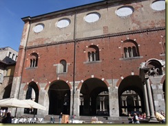
Here is the Palazzo della Ragione which built in the 13th century.
On one side of the building is the Scrofa Semilanuta (aka the Wooly Sow) which is an old symbol of Milan and on the other side is a statue of Oldrado da Tresseno who was a 13th century politician and also a Mayor of Milan.
The Duomo is as impressive as we imagined it to be and the square in front is large.
Pat stood in a very similar spot in 1964 and also had her photograph taken then.
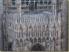
The carved detail around the Duomo is amazing and you get a very good close up view from the cafes on the top floor of the department store la Rinascente which is next to the Duomo.
The stained glass windows inside the Duomo are bright and a pleasure to look at. Unfortunately when we were there, the rear of the Duomo was closed off and we could not get a good view of the three major windows at the end of the church.
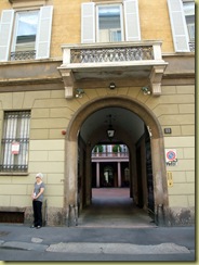
Many of the old houses have large ornate doors leading to internal quadrangles
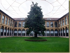
and the views through the doors are very picturesque. One can go through some of the doors into the quadrangle and this one was
particularly interesting with its light sculpture above the central tree.
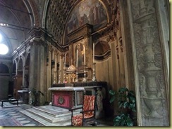
The use of “trompe d’oeil” is common in paintings and we found a church where it had been used to give the impression that it was larger than it was and of a particular cruciform design which the land upon which is was built would not allow. Santa Maria presso San Satiro (dating from the late 1400s onwards) is built on a plot of land not large enough to enable it to take the usual cross shape with the choir in an arm at the top of the church.
So the architect (Donato Bramante) used “trompe d’oeil” to create the impression of depth at the choir end of the church.
These photographs show that it exists but its true effect can only be appreciated when standing in the church.
Mistakes in Building Design
The town planners of Milan can demonstrate however that they are able to make the same mistakes as planners all over the world.
For unfathomable reasons, they allow
monstrosities to be constructed next to buildings of character. Will they ever learn?













No comments:
Post a Comment